AI HTML Email Template Generator – Create Email Templates with AI
Create polished, responsive HTML email templates faster with our AI HTML Email Template Generator. Generate clean…
Create stylish CSS buttons for your website without writing button styles from scratch. With this CSS Button Generator, you can adjust colors, size, spacing, borders, hover effects, and other button settings, then copy the generated CSS for your project.
The preview background is only for viewing and is not included in the generated code.
Creating an attractive clickable element for your website often involves writing several lines of styling code. This CSS Button Generator is a visual button creator that lets you design exactly what you want through a visual interface and instantly provides the ready-to-use CSS or HTML and CSS code.
The visual interface takes the guesswork out of web design by updating the live preview instantly as you move sliders and change colors. You never have to refresh the page or guess what a specific pixel value will look like. Every change you make to the spacing, typography, or color is immediately reflected on the screen, saving you time and effort.
You get complete control over interactive states without needing to write animation logic. The hover effects allow you to create buttons that grow, lift off the page, and change colors smoothly when a visitor interacts with them. These animated interactions make a website feel much more responsive and professional.
When you finish your design, getting the final product is incredibly fast. The tool packages your exact settings into clean, formatted text that you can grab with a single click. You can choose to copy just the styling rules if you already have your webpage set up, or grab both the structure and the styling together if you are building something from scratch.
The output provided by this tool applies styles to a specific class named .custom-button. The logic behind the scenes takes your visual choices and translates them into standard web properties. For example, when you adjust the hover scale slider to 103%, the tool divides that number by 100 to write the proper scale value of 1.03 in the final output.
Colors require specific formatting to work well on the web. When you enable a drop shadow, you pick a solid hex color and a percentage for opacity. The logic converts that solid hex color into an RGBA format, combining your chosen color with your chosen opacity percentage so the shadow becomes properly see-through.
Options in this tool interact with each other in specific ways. If you check the box to use a gradient background, the hover behavior changes automatically. Instead of swapping to a solid hover background color, the tool applies a brightness filter of 1.12 to your gradient, making it lighter when the mouse passes over it. In this state, the normal hover background color setting is completely ignored.
There are also physical limits built into certain styles to prevent visual errors. If you choose the double border style, standard web rules require the border to be at least 3 pixels wide to actually show two distinct lines. If your border width slider is set lower than 3 pixels while the double style is active, the generated output will automatically force the width to 3 pixels.
The preview stage is purely for your convenience. While you can change the preview background color to see how your design looks against dark or light themes, that specific background color is never included in the final text you copy or download. Finally, the tool requires valid input to function; if you delete all text from the input field or enter an invalid color code, it will clear your results and display an error message.
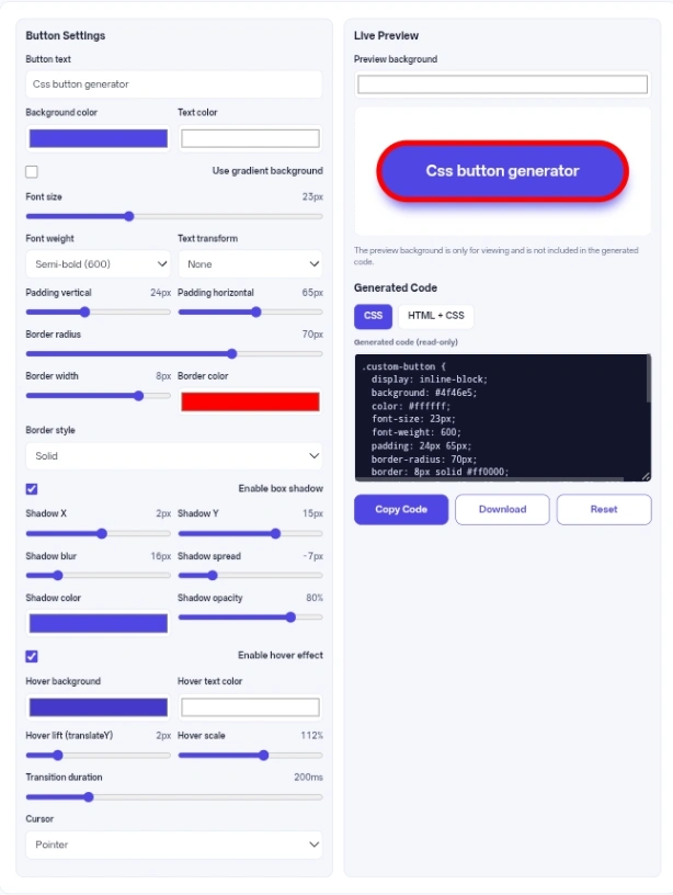
Input “Subscribe Now” -> Action: Check the gradient box, set a blue start color and a purple end color, change the border radius to 30 pixels, and enable a soft drop shadow -> Result: You get the code for a modern, pill-shaped call-to-action button perfect for a newsletter signup section.
Input “Submit Application” -> Action: Pick a solid green background, set border radius to 4 pixels, enable the hover effect, set the hover background to a darker green, and set the hover lift to 3 pixels -> Result: A traditional, trustworthy form submission button that turns a darker green and pops up slightly when a user gets ready to click it.
Input “Learn More” -> Action: Set the background color to match your website exactly, make the text color blue, set the border width to 2 pixels with a blue border color, and set the hover background to blue with white hover text -> Result: A hollow ghost button that fills in with solid color when hovered, ideal for secondary links on a busy page.
To get the most accurate feel for your design, always set the preview area background to the exact hex color of the website where the element will live. This is especially helpful for judging drop shadows, as a shadow that looks great on a white background might disappear entirely or look messy on a darker page.
When animating your hover states, keep your transition duration between 150 and 300 milliseconds. Anything faster can feel abrupt and glitchy, while anything slower than 300 milliseconds can make your website feel sluggish and unresponsive to the visitor.
If you add a drop shadow, keep the opacity low. A shadow with an opacity between 10 and 20 percent usually provides a clean, modern sense of depth. High opacity shadows often look harsh and dated.
If you plan to design multiple different buttons for the same website using this tool, remember to change the .custom-button class name in your stylesheet after you paste the code. If you do not rename them, the styles from your newest design will overwrite the styles from your earlier designs.
This tool works in your web browser using JavaScript. It does not use any external API, and it does not send your button text, color choices, or generated code to a server. The tool does not intentionally save your settings, so they are lost when you close or refresh the page.
This generator makes it easy to design interactive web elements visually without having to memorize styling properties or animation logic. By translating your slider adjustments directly into clean, ready-to-use code, it saves time and helps keep your web projects moving smoothly.
The tool requires text to function properly. If you clear the field entirely, an error message will appear, and the output box will clear itself until you type something in.
If you have the gradient option turned on, the tool ignores your chosen hover background color. Instead, it automatically brightens your gradient when a user hovers over it. To use a solid hover color, you must turn off the gradient option.
Depending on which tab you have selected, clicking download will give you either a file named button.css containing only the styling rules, or a file named button.html containing both the structure and the styling.
A double border requires at least 3 pixels of space to draw two separate lines. The tool automatically enforces a 3-pixel minimum width in the generated output whenever the double style is selected, even if your slider is set lower.
There is no font family selector in this tool, and the generated code does not set a font family. A button element may therefore show your browser’s default font instead of your website’s font. To make it match your website, add font-family: inherit; to the copied CSS.
No, the background color you choose for the live preview area is only there to help you design. It is completely excluded from the final code you copy or download.