Create Soft UI Designs Easily with a CSS Neumorphism Generator Online
Create clean neumorphic CSS styles without writing everything from scratch. The CSS Neumorphism Generator lets you adjust the look of your design and quickly get CSS code you can use in your web projects.
How to Use
Creating a soft UI look requires precise shadow values, and this CSS Neumorphism Generator handles the math while giving you a live preview. Follow these steps to build your custom element:
- Enter a hex code into the Background color (hex) field or click the attached box to use your system’s visual color picker.
- Choose a Shape from the dropdown menu (Flat, Concave, Convex, or Pressed (inset)).
- Select a Light source direction (Top left, Top right, Bottom left, or Bottom right) from the second dropdown.
- Move the Size slider, which ranges from 50px to 300px, to scale the main container.
- Adjust the Radius slider, ranging from 0px to 150px, to round the corners of the shape.
- Fine-tune the Distance, Blur, and Intensity sliders to change how far the shadow casts, how soft its edges are, and how dark it appears.
- Review the live preview box centered directly above the code output area.
- Click Copy CSS to grab the code from the Generated CSS box, or click Download .css to save it as a local file.
Features / Benefits
This CSS Neumorphism Generator updates the visual preview instantly as you move any slider or alter a dropdown setting, letting you evaluate design tweaks without refreshing the page. The background color input synchronizes directly between a standard text field and the visual picker, giving you two distinct ways to establish the base shade.
The tool outputs a complete class block inside a read-only text area that spans nine rows. This block automatically writes the correct width, height, border-radius, background, and box-shadow properties based entirely on your active settings. If you want to start over from scratch, a dedicated Reset button restores all inputs back to their initial state, clearing any error messages and resetting the hex code to #e0e0e0.
Detailed Information
The calculations in this CSS Neumorphism Generator rely strictly on modifying your chosen base hex color. To create the 3D effect, the logic generates a dark shadow by reducing the RGB channels of your color based on the intensity slider. It creates the opposing light shadow by increasing the color’s brightness up to a strict numerical limit. The Distance setting shifts these two shadows in opposite directions on the X and Y axes depending on the chosen light source.
When you select the Concave or Convex shape options, the tool replaces the solid background with a CSS linear gradient to simulate a curved surface catching the light. The Concave setting creates a gradient that shifts from a 10% darker version of your base color to a 7% lighter version, while the Convex option reverses that order. The angle of this gradient shifts automatically; for example, a Top left light source sets the angle to 145 degrees, while a Bottom right source sets it to 315 degrees. The logic only accepts valid 3-digit or 6-digit hex colors and does not support RGB, HSL, or standard CSS color names.
Common Uses / Examples
Here are a few ways designers use this CSS Neumorphism Generator to build interface components:
Input the default #e0e0e0 color with a Flat shape -> Action leaves the Size slider at 200 and the Radius slider at 50 -> Result yields a soft, raised square container suitable for housing simple text or icons.
Input the Pressed (inset) shape -> Action lowers the Distance slider down to 5px -> Result creates a sunken, hollowed-out look that visually suggests an active toggle state or an empty text box.
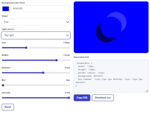
Input a high Radius of 150px -> Action switches the shape dropdown to Convex -> Result yields a perfect circle that bulges outward like a physical hardware dial on a synthesizer.
Tips / Best Practices
Always check your final design for readability. This design style inherently suffers from low contrast, so you must test any text or icons you place inside the previewed shape to ensure they remain legible against the background.
If you are working with a very dark background, push the Intensity slider much higher. The math behind the dark shadow cannot darken a color that is already close to pure black, so increasing intensity ensures the lighter edge stands out enough to establish physical depth.
The code provided by the tool consists entirely of styling rules. You must manually add the assigned class name to the elements in your own HTML document for the visual changes to take effect on your website.
Privacy & Security
This tool performs all of its calculations directly within your web browser using JavaScript. No server requests are made when you adjust sliders or generate the code. The tool does not send your settings to any server, and it does not store them.
Conclusion
Building precise soft UI elements is much faster when you can adjust the shadows visually instead of guessing numbers. This CSS Neumorphism Generator handles the complex color math automatically and outputs clean code you can drop right into your project.
FAQ
What happens if I type an invalid color format?
If you enter something that isn’t a hex code, an error message appears reading, “Please enter a valid hex color, for example #e0e0e0 or #ddd.” The preview stage will dim, the CSS output box clears completely, and both the copy and download buttons become disabled.
Can I output the code from this CSS Neumorphism Generator for multiple elements at once?
No, the logic only writes a single CSS block for one specific element at a time. It does not output separate interaction states like hover or active.
Why do the copy and download buttons sometimes fail?
If your browser blocks clipboard access for security reasons, the interface shows an error asking you to select and copy the text manually. If your browser does not support local file generation, an error message suggests using the copy button instead.
How does changing the light source affect the shadows?
Changing the light source flips the X direction, the Y direction, or both, of the box-shadow offsets. The dark shadow always casts away from the light source, while the light shadow casts toward it.
Does the output include vendor prefixes for older browsers?
The generated text contains only standard CSS properties. It does not add specific prefixes for older versions of Safari or Chrome.
What file format does the download button create?
Clicking the download button generates a single plain text file exactly named neumorphism.css containing your custom class.