Create Modern Frosted-Glass Effects with CSS Glassmorphism Generator
Create stylish frosted-glass designs without writing CSS from scratch. The CSS Glassmorphism Generator lets you adjust blur, transparency, colors, borders, and other settings, then quickly get CSS code that you can use in your web projects.
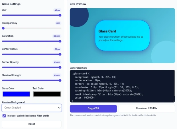
Glass Settings
Live Preview
Glass Card
Your glassmorphism effect updates live as you adjust the settings.
The preview card needs a colorful or image background behind it for the blur effect to be visible.
How to Use
The CSS Glassmorphism Generator is a browser-based tool that lets you design frosted glass visual effects for web elements and instantly provides the matching code.
- Adjust the Blur, Transparency, and Saturation sliders to define the basic frosted look.
- Use the Border Radius, Border Opacity, and Shadow Strength sliders to shape the card and give it depth.
- Pick a Glass Color and Text Color using the provided color pickers.
- Select a Preview Background from the dropdown (like Ocean Gradient or Custom Colors) to see how the glass reacts to different environments behind it.
- Leave the Include -webkit-backdrop-filter prefix checkbox ticked for broader browser compatibility.
- Click Copy CSS to grab the text, or Download CSS File to get it as a document. If you want to start over, hit Reset.
Features / Benefits
This CSS Glassmorphism Generator provides an instant live preview. As you move the sliders, a visual stage featuring a sample card and decorative circular shapes updates immediately. You never have to guess what your adjustments look like or switch back and forth between a code editor and a browser.
The tool handles the color conversion behind the scenes. When you select a color from the Glass Color picker, the script automatically translates the hex value into the RGBA format required to create the transparent background layer and the semi-transparent border.
The Text Color is written to the output as a regular hex value. The read-only text area at the bottom continuously rewrites the styling rules as you experiment.
You also get direct export options right below the code box. A simple button press copies the text directly to your clipboard, while the download option creates a ready-to-use stylesheet file on your device.
This saves you from manually creating, naming, and saving a new text document on your computer.
Detailed Information
When operating the CSS Glassmorphism Generator, all processing happens locally in your web browser through JavaScript. The tool relies on specific styling properties, primarily backdrop-filter which handles the blur and saturation, and rgba background values that manage transparency.
There are a few fixed parameters in the generated output. The code is always wrapped in a specific class named .glass-card. Additionally, the drop shadow color is hardcoded to a dark blue tint, though you control its overall opacity from 0 to 0.5 using the strength slider.
The preview stage options do not affect the final code. The background gradients or custom colors you select are purely to help you visualize the frosted effect on screen. The final output only contains the properties for the glass element itself, not the backdrop behind it.
Inputs are strictly bounded by their sliders. For example, blur reaches a maximum of 40px, while saturation can be pushed up to 300%. The tool scales percentages down to decimals for the code output, meaning a transparency setting of 25% becomes an alpha value of 0.25 in the final text.
Common Uses / Examples
Here is how you might configure the CSS Glassmorphism Generator for different design scenarios.
Input: Default settings but change Preview Background to Dark Night. -> Action: Click Copy CSS. -> Result: You receive styling for a soft white frosted card that stands out clearly against dark backgrounds, featuring a 16px border radius and a 12px blur.
Input: Blur at 40, Transparency at 80, and Saturation at 150. -> Action: Review the live stage. -> Result: The card becomes mostly opaque, so the shapes behind it are only faintly visible through a strong blur. This setup suits panels placed over busy backgrounds where text readability matters. Since the default Text Color is white, switch it to a dark shade when you use a light Glass Color at this transparency.
Input: Select “Custom Colors” in the dropdown, set Background Color 1 and Background Color 2 to preview the glass on your own backdrop, then pick a Glass Color tint. -> Action: Click Download CSS File. -> Result: A file named glassmorphism.css is saved to your device. It contains your Glass Color as a tinted rgba background and border, but not the Background Colors, because those are used for the preview only.
Tips / Best Practices
The frosted effect requires underlying content to work. If you place the generated styling over a solid white or flat gray background in your website, the blur will be invisible. Always position the glass element over an image, a gradient, or moving shapes.
Keep the border opacity relatively low. A value around 20% to 30% creates a realistic edge reflection, whereas a 100% opaque border breaks the illusion of physical glass.
Match your text color to your transparency. If you choose a highly transparent setting, make sure the text color heavily contrasts with the background image you plan to use it on, as the glass itself will not provide enough visual separation.
Privacy & Security
This tool operates entirely within your local web browser. No data, color choices, or generated styles are sent to any external server or API. Because it uses client-side JavaScript exclusively, there is no database storing your configurations, nor does it use cookies or local storage to track your activity. All styles are generated by JavaScript running in the page itself.
Conclusion
The CSS Glassmorphism Generator provides a quick, visual way to build and export frosted glass effects without writing the properties by hand. Its direct controls and local processing make it an efficient addition to any web design workflow.
FAQ
What happens if the glass color value is invalid?
The Glass Color picker only accepts colors chosen through the browser’s color selector, so you cannot type a hex code manually. As a safety measure, if the tool ever receives an unreadable glass color value, it falls back to white for the glass tint so the generator keeps working.
Why does my downloaded file not contain the gradient background?
The CSS Glassmorphism Generator only creates the styling for the glass card element itself. The gradients are just a staging environment to help you see the transparency in action.
Does the -webkit-backdrop-filter prefix change the visual result?
It does not change how the card looks in modern browsers. It simply makes sure that the blur and saturation effects work correctly on older versions of Safari and iOS devices.
What happens if the code copying fails?
If your browser blocks clipboard access, a red error message will appear underneath the code box. You can then manually highlight the text in the Generated CSS area and use your keyboard shortcuts to copy it.
Why are my background color pickers hidden?
The two background color inputs only reveal themselves when you select Custom Colors from the Preview Background dropdown menu. They remain hidden for all other preset gradient options.